Charts are one of the easiest ways to turn rows of numbers into clear, professional visuals.
Whether you are creating monthly sales reports, tracking business performance or presenting data to clients, knowing how to create charts in Excel can make your spreadsheets far more impactful.
If you are new to Excel charts or want to develop more advanced charting skills, our Intermediate Excel course and Advanced Excel training course can help you build your skills more efficiently.
In this guide, we will show you how to create the most popular Excel charts, including bar charts, pie charts, comparison charts, Gantt charts and more.
Looking for more Excel tips? Read our guide.
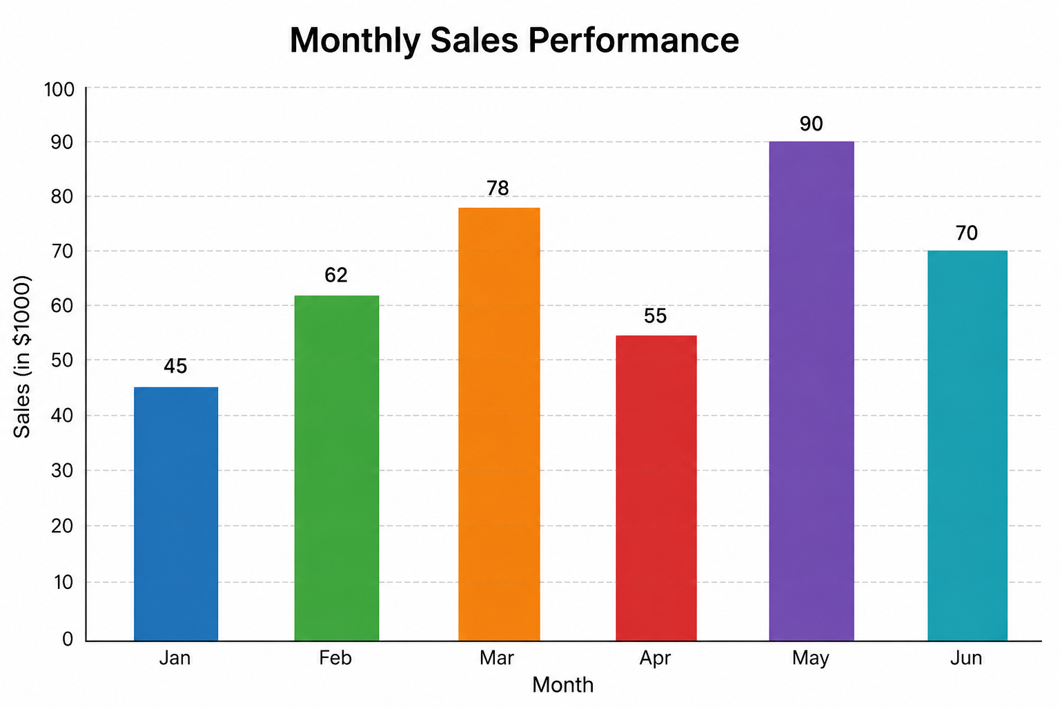
1. How to Create a Column Chart in Excel
Best for: Comparing values across different categories.
Column charts are one of the most commonly used Excel charts because they are easy to read and ideal for business reports.
How to create a column chart in Excel:
- Select your data, including the column headings.
- Click the Insert tab.
- Choose Column or Bar Chart.
- Select Clustered Column.
- Add a chart title and customise the colours if required.
Example: Compare monthly sales across different departments.
✅ Learning how to create a column chart in Excel is one of the first Excel chart skills every professional should master.
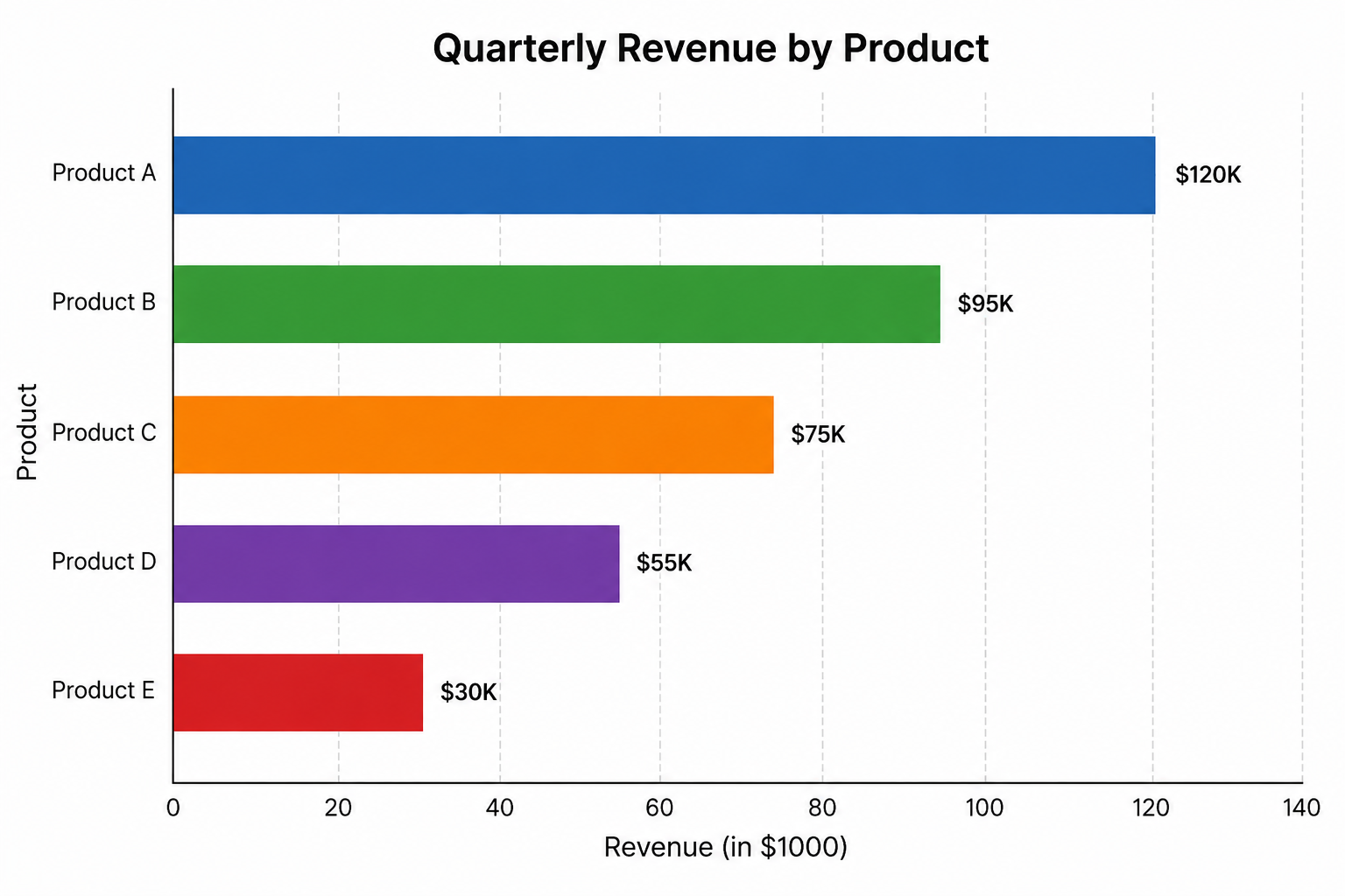
2. How to Create a Bar Chart in Excel
Best for: Comparing long category names or ranking data.
Bar charts display data horizontally, making them ideal when category labels are lengthy or when several items need to be ranked.
How to create a bar chart in Excel:
- Highlight your dataset.
- Go to Insert > Column or Bar Chart.
- Select Clustered Bar.
- Format the chart using the Chart Design tab.
Example: Display employee performance rankings or customer satisfaction scores.
✅ If you have been searching for how to create a bar chart in Excel, this method works in recent versions of Microsoft Excel.
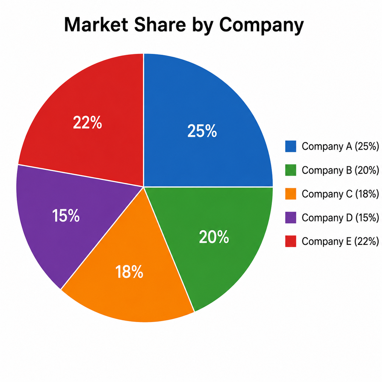
3. How to Create a Pie Chart in Excel
Best for: Showing percentages or parts of a whole.
Pie charts work best when you have a small number of categories that together represent 100% of a total.
How to create a pie chart in Excel:
- Select your category names and values.
- Click the Insert tab.
- Choose Pie Chart.
- Add Data Labels to display percentages.
- Adjust the colours for better readability.
Example: Show how an annual budget is divided across different departments.
✅ Knowing how to create a pie chart in Excel helps make percentage-based reports easier to understand.
4. How to Create a Comparison Chart in Excel
Best for: Comparing two or more datasets side by side.
Comparison charts are commonly used in finance, HR and sales reporting to show differences between datasets clearly.
How to create a comparison chart in Excel:
- Arrange your data with categories in one column and multiple value columns beside it.
- Highlight the data.
- Go to the Insert tab.
- Choose Clustered Column or Clustered Bar Chart.
- Format the legend and colours to distinguish each dataset.
Example: Compare this year’s sales against last year’s performance.
✅ If you are wondering how to create a comparison chart in Excel, clustered charts are usually the best choice.
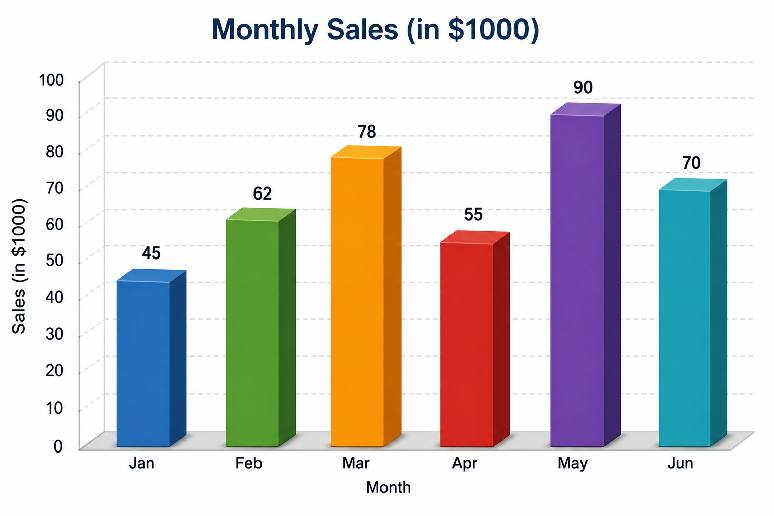
5. How to Create a 3D Column Chart in Excel
Best for: Creating visually engaging presentations.
Although 3D charts should be used sparingly, they can add visual impact when presenting simple and straightforward data.
How to create a 3D column chart in Excel:
- Select your data.
- Click the Insert tab.
- Open the Column Chart menu.
- Choose 3D Column.
- Use the Chart Design tab to adjust the colours and style.
Example: Present quarterly revenue figures during management meetings.
✅ Learning how to create a 3D column chart in Excel can help make presentation slides more engaging.
6. How to Create a Donut Chart in Excel
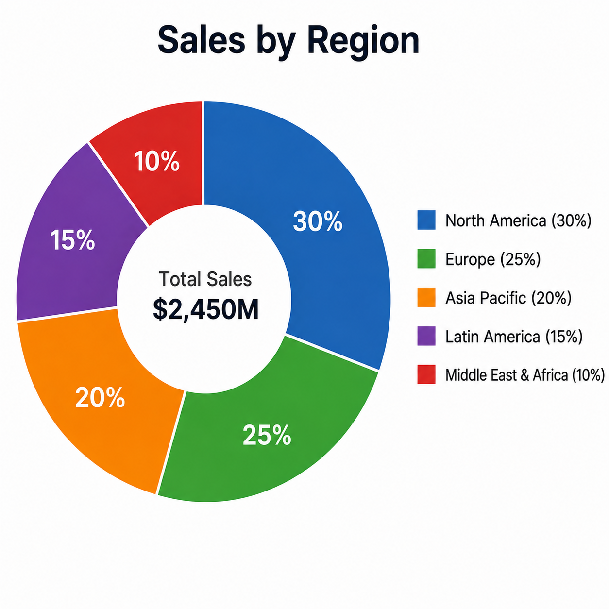
Best for: Displaying proportions with a modern appearance.
A donut chart is similar to a pie chart but includes a hollow centre, making it easier to display an additional figure or label.
How to create a donut chart in Excel:
- Select your data.
- Go to Insert > Pie or Doughnut Chart.
- Choose Doughnut.
- Format the colours and labels.
- Adjust the doughnut hole size if required.
Example: Show product-category sales while maintaining a clean dashboard design.
✅ Many dashboard designers prefer donut charts to traditional pie charts when creating modern reports.
7. How to Create a Gantt Chart in Excel
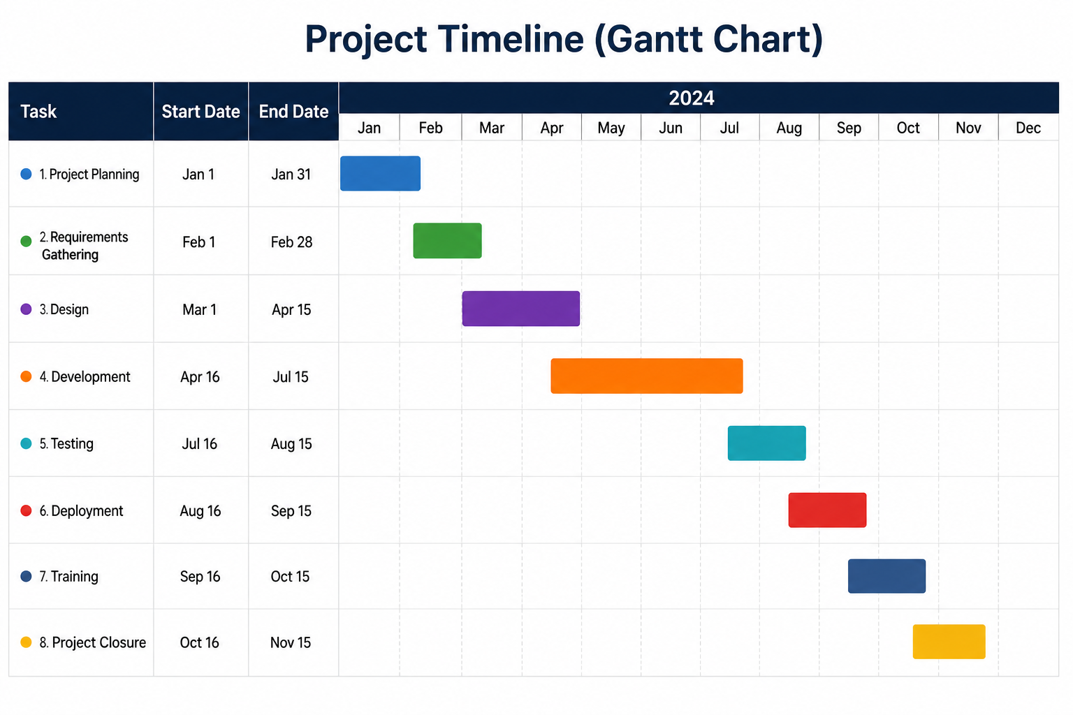
Best for: Project planning and timelines.
Although Excel does not include a dedicated Gantt chart type, you can create one by formatting a stacked bar chart.
How to create a Gantt chart in Excel:
- Create columns for:
- Task
- Start Date
- Duration
- Select the data.
- Insert a Stacked Bar Chart.
- Format the Start Date series with No Fill.
- Reverse the task order for a traditional Gantt layout.
Example: Track project milestones, activities and deadlines.
✅ Understanding how to create a Gantt chart in Excel is invaluable for project managers and team leaders.
8. How to Create an Org Chart in Excel
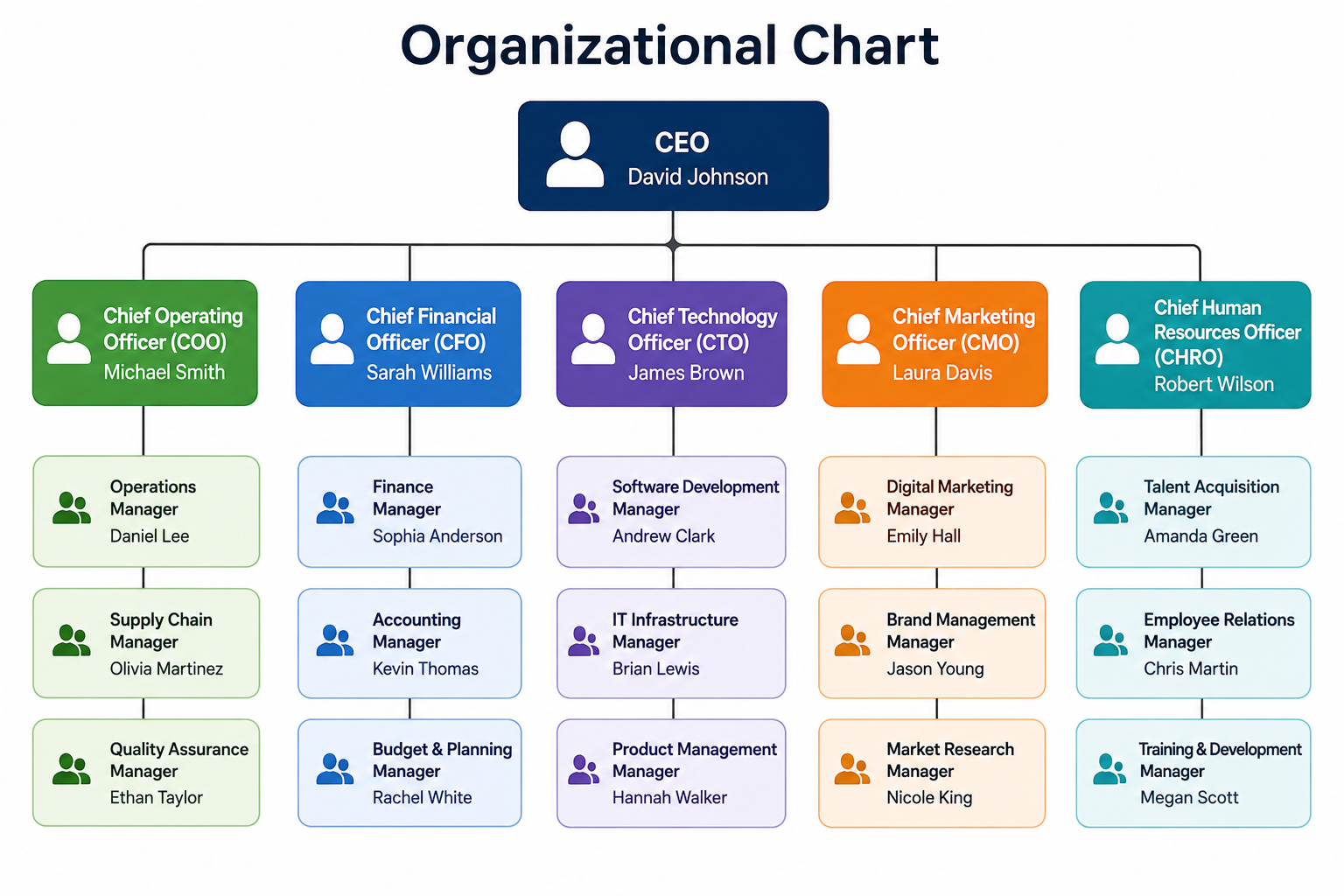
Best for: Displaying company structures.
Organisation charts help visualise reporting lines, departments and employee roles within a business.
How to create an org chart in Excel:
- Go to Insert > SmartArt.
- Select Hierarchy.
- Choose Organisation Chart.
- Add employee names and job titles.
- Use SmartArt Design to add, move or remove positions.
Example: Display your company’s management hierarchy.
✅ If you are learning how to create an org chart in Excel, SmartArt is usually the quickest solution.
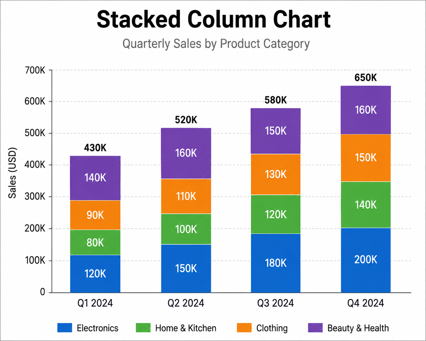
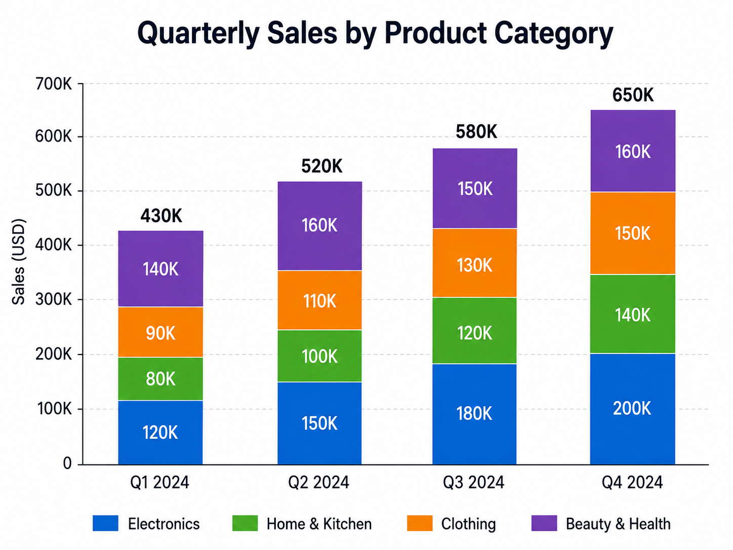
9. How to Create a Stacked Column Chart in Excel
Best for: Comparing totals while showing individual contributions.
Stacked charts help visualise how several values combine to form a total while still showing the contribution of each individual series.
How to create a stacked column chart in Excel:
- Select your data.
- Go to the Insert tab.
- Choose Stacked Column Chart.
- Add data labels if required.
- Format the colours for each series.
Example: Show sales by region and product category.
✅ Knowing how to create a stacked column chart in Excel makes complex reports easier to interpret.
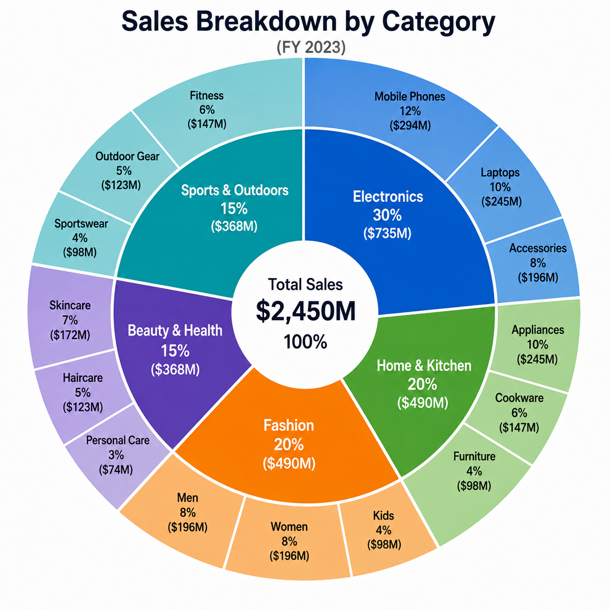
10. How to Create a Sunburst Chart in Excel
Best for: Visualising hierarchical data.
Sunburst charts display multiple levels of information in concentric rings. The inner rings show the main categories, while the outer rings show their related subcategories.
How to create a sunburst chart in Excel:
- Arrange your data in hierarchical columns.
- Highlight the dataset.
- Go to Insert > Hierarchy Charts.
- Select Sunburst.
- Format the colours and labels.
Example: Display product categories and their related subcategories.
✅ Learning how to create a sunburst chart in Excel is useful when presenting structured or multi-level datasets.
Tips for Creating Better Excel Charts
No matter which chart you choose, these simple best practices will improve readability:
- Keep chart titles short and descriptive.
- Avoid unnecessary 3D effects unless they add genuine value.
- Use consistent colours throughout your workbook.
- Label important figures with data labels.
- Remove unnecessary gridlines to reduce visual clutter.
- Choose the chart type that best matches your data.
- Check that all text remains readable on mobile devices.
Ready to Master Excel Charts?
Learning how to create charts in Excel is one of the quickest ways to improve your reporting skills. From simple column charts to advanced Gantt and Sunburst charts, Excel provides powerful visualisation tools for every industry.
Whether you are creating dashboards, financial reports, HR metrics or project plans, mastering these chart types will help you present information more clearly and make better business decisions.
Looking to upskill your team? Our hands-on Microsoft Excel training courses across Dubai and the Middle East teach professionals how to create charts in Excel, build dashboards, analyse data and automate everyday tasks.